
Thursday, 27 November 2008

Wednesday, 26 November 2008
Barcelona: Image Two Idea

The idea for this image is that there are 15 areas, like counties, in Spain. These are represented by all the little birds. The larger bird facing inwards represents Catalonia, and though it is apart of Spain, it is clearly different and wants to be seen as separate from the rest of the country. I hope that this message is clear to the audience.


Barcelona: Cover Developments


 Here are some of my developments for the book cover. At the moment I prefer the original black and white idea, as I find it very difficult to incorporate colour into an image.
Tuesday, 25 November 2008
Barcelona: Image One Idea


 The idea behind this image is that one of the birds, representing the Catalans, is speaking but the other bird, the smaller bird who represents the Spanish-speaking people, doesn't understand.
Barcelona: Cover Ideas


The brief for the Barcelona project requires a book cover and two images to illustrate a chapter from Giles Tremlett's book, Ghosts of Spain. The chapter is called The Madness of Verdaguer and is, basically, about the differences between the population of Spain, those who speak Spanish and those who speak Catalan. Though I found the text very difficult to understand, as it is very political, I interpreted it as being about a war on language and culture. Catalan's think of themselves as superior to the Spanish, and the Spanish do not associate themselves with the Catalans because of this. The idea behind the themes for the cover is that the bird in the cage represents Catalans. The flying birds represent the Spanish, who are free, whereas the caged bird is trapped and wants to escape. This is meant to represent the Catalans, who wish to break free from Spain. This idea could also work the other way around: the caged bird could represent the Spanish and the flying birds, representing Catalans, are breaking free. I haven't decided which direction I want this to take yet.
Circus Observation


 I have noticed recently that the term "Circus" has been used as a name for music CD's, such as Pink, Britney Spears and Take That. This leads me to believe that it is being used as a metaphor to represent the media-crazed public who follow every step that a celebrity takes, completely changing the original meaning of the word.
Monday, 24 November 2008
Double G Studios: 21.11.2008
Grant Gilbert, twenty years ago, completed a two year National Diploma in Graphic Design. He then completed a print-based degree in Birmingham. After leaving university, Grant got a job at Planet 24 in the graphics department. After three years, Grant moved to Channel 4, doing promos and title sequences. This was different to working at Planet 24 because there were bigger budgets and there was a bigger audience. After three years at Channel 4, in 2000, he moved to Attic in New York. A year later he moved back to London and began working freelance as a designer. A couple of years ago he decided to start Double G studios, as he found it important to promote himself as a business. This enables him to commission other designers for bigger jobs, but all looks more professional to potential clients. He doesn’t like the term graphic designer, as he believes it can pigeonhole you.
CHANNEL 4 MUSIC PROMO
After bring commissioned, the first thing Grant does, as a rule, is sketch ideas. The idea for this brief was to wrap people in neon cable and fibre optics. After he had sold his idea to Channel 4, he sat with the producer to finalise the idea. The final idea was to stream neon cables out of glowing tents, influenced by LED displays. He created mood boards depicting what he thought the final product would look like in Photoshop. When creating a live action piece, it is important to have a detailed storyboard or shot list. The final filmed action is then edited and then it went through post-production by Smoke and Mirrors, a company in London.
MORE 4
For this brief, Grant worked with Spin, a print-design company in London, for four months. The creative director of the job wanted a Saul Bass inspired piece. They wanted to create a navigational system using the More 4 logo, and also a font. After trying many different colour schemes, the final colour scheme became green with green and blue hues. They had to create a visual language. It had to be modern and masculine but not too young. The on-screen presentation, OSP, is the colour scheme, font, background, etc. In the end, the background colour became black, as it was simple. When creating the animation developments, Grant used basic after-effects animation, and tried to integrate shapes and type. The Mill in London worked on the final animation in 3D. When the channel was being launched, it was promoted as an adult channel to gain interest, though instead it gained a lot of complaints.
BBC ONE
Grant worked with a company called Red Bee, who was pitching a rebrand idea to BBC one. As it was such a big project, a lot of people were involved. One part of the brief stood out to Grant, “BBC one is all about sharing and coming together”. So Grant began looking at the BBC one logo, and how it has changed, since it began, such as the 1953 Abram Games logo. He then saw a film about the Korean games in which hundreds of children hold up books of different coloured pages, to create giant images, but the BBC disliked this idea, but they liked the theme of community so they were given the job. Grant made a connection with the logos that BBC one had over the years, a circle. A circle can also represent unity. The BBC liked the idea of using a circle as a theme. To create a font to go with this new look, Fontsmith, a company who designs fonts, were hired. The circle was then put into the real world, these were called idents. A company called Framestore, who worked on Harry Potter, helped to create some for the 3D animation used. There were eight idents; hippos, roses, fire, kites and motorbikes. The brief took 10 months to complete and cost £1.2 million. As this was funded by public money, there was a backlash about the amount of money spent.
QUESTIONS
Q: Would you recommend working with others or alone?
A: you get fresher work when you work with other people but there can be conflict and a difference of opinion.
Q: How much work is pitched?
A: 70% of the time, but when you work with a company, they often use you again.
Q: As a judge of the D&AD commercial awards, what advise would you give when entering into such a competition?
A: Don’t overload the judges. Submit simple and striking work.
As I have never heard of Grant Gilbert, I had no expectations but I found the lecture extremely interesting. I thought the range of work that he completed was interesting as well as it proves that, as a designer, you are able to cross boundaries and explore other areas. I also think it is reassuring to know that somebody from Stockport College can become a success!!!
Friday, 21 November 2008
Grandpa Simpson
 I was watching the latest episode of the Simpsons (Series 20, Episode 6), in which Lisa gets addicted to crossword puzzles and Grandpa Simpson says something about crossword puzzles which I think is really cute and funny:
"I've been doing them since 1958. Back then we called them alphabet hotels, cause each letter gets its own little room!"
Thursday, 20 November 2008
Eric Gill
 Nina advised me to look at the work of Eric Gill for his use of typography. I like the way Gill has combined lettering with imagery in a way that compliments the two, rather than having one element dominate the image.
Wednesday, 19 November 2008
Dan Funderburgh


I found the work of Dan Funderburgh in a surface design book and really liked the detail in it. I also like how he uses unusual imagery, such as a bicycle, in very traditional pattern designs.
See more of his work at: www.danfunderburgh.com
Sanna Annukka

 I have looked at the work of Sanna Annukka before, after seeing her portfolio on the Big Active website, and after a post on here, by Tamara, recommending her work, I decided to look at her work again, and I'm glad I did. I think her work is gorgeous. The colours she uses are so vivid and bold, but the unusual shapes she creates keeps her work interesting even in a full black and white image.
See more of her work at: www.sanna-annukka.com
Charley Harper
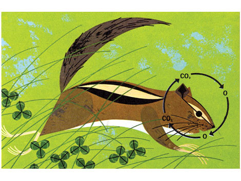
 Charley Harper is someone that inspired me last year for his use of colour and shape. What I find most fascinating about his work is that it was produced completely by hand, yet the work is so precise, it looks as though it could have been created on a computer. The subject matter in a lot of his work was based on science, yet his style made it interesting to the viewer, which for a mundane subject is extremely hard to do. Though you are able to tell what each animal is in his work, Charley creates characters and gives each animal a personality, making his work extremely unique.
Tuesday, 18 November 2008


Monday, 17 November 2008
Patrick Thomas: 11.11.2008 (Barcelona Studio Visit)


Patrick Thomas was born in Liverpool in 1965. He studied BA Graphic Design at Central St. Martin’s in London and studied an MA at the Royal College of Art, finishing in 1987. After leaving the RCA, he set up a studio called Big Orange, in collaboration with other graduates from the RCA, such as Paul Davis, Andrew Pavitt, and Laurence Zeegan, who runs the Brighton studio, Jason Fodd, Marion Duchamp and Dan Williams, who is based in Glasgow.
In the late 1980’s, Patrick decided that he no longer wanted to live in England, as he sought warmer climates. At this time, Barcelona was in the media as they hosted the 1992 Olympics and in 1991, Patrick moved to Barcelona. He arrived at the Ramblas, and worked freelance from a hotel room, until, three months in, he got a job designing the evolution of the Olympic mascot.
In 1997, after six to seven years of working freelance, Patrick met Angela, a fellow designer, and set up Studio La Vista, a very small studio in which they have three full-time staff.
In 2005, Patrick set up Studio Imprint, for his editorial work and created the “Black and White Book”.
In 2006, Patrick became a member of AIGI and at this time, he began screen-printing.
His favourite colour is red and is uncomfortable with the word “illustrator”. As a child, he enjoyed stamp collecting.
As a child, Patrick enjoyed visiting the Walker Art Museum in Liverpool, and loves the life-size painting of Henry the 8th.
When Patrick was in his early teens, the punk era began, though he was too young to be involved in this culture. Through his brother, he was able to listen to this kind of music and the album covers, such as God Save the Queen by the Sex Pistols, designed by Jamie Reid, and Peter Blake’s design for the Beatles’ St. Peppers sleeve. Other influences include William Hogarth, an important English engraver, and El Lissitsky and Alexander Rodchenko. He has also looked at the work of Juan Brossa, for his use of type and visual games.
A lot of Patrick’s work is of the supplement cover of a Spanish newspaper. It is a financial supplement called Dinero, and when the newspaper relaunched, he also helped to redesign its format. The brief he gets for the supplement is given to him on a Thursday evening, and then handed on a Friday morning. He tries to make his images very punchy and very direct and he loves using clichés in his work. His work is often a play on imagery, such as creating a flag made up from smaller, separate images. He also occasionally uses typographic solutions. He also uses a lot of American imagery such as the American flag and a dollar symbol, in relation to the subject matter of the supplement being finance. All of the imagery that he has created for Dinero over the years is contained within a book called “Black and White”. The book contains a quote of Patrick’s, “A good idea should work in black and white”. He also creates editorials as well as covers for Dinero.
Patrick creates quite a lot of work for the New York Times Sunday book review supplement. Another influence to him is the illustrator Cristof Niemen. Patrick loves to use clip-art, as he likes using images that everyone can use but makes it their own. In one of his pieces entitled “The Foxes and Hound”, he uses images by Thomas Buick, a wood engraver. Another influence is Alan Fletcher and the man who designed the German typeface Futura, Paul Renner.
Inkwork is another side business that Patrick has set up that creates purely typographic postcards, which are available to buy all over Barcelona. So far they have printed over 600,000 postcards, and they contain messages such as “Made In Barcelona” and “Fish and Chips”.
I did like the work of Patrick Thomas but I almost wonder if he is a fraud at what he does, as he so often uses images and logos that were created by somebody else. It makes me question my own work and the references I use within my images and how much of the work is actually my own. But, as always, I think it is fantastic to see an illustrator become successful at what they do. I particularly liked the Inkwork project, as, due to my interest in typography, I find it intriguing when purely typographic work is a success. Overall, I found the visit to his studio interesting, as I was able to see an illustrator in his working environment.
See work at: www.patrickthomas.com
Subscribe to:
Posts (Atom)