
Hi Leanne,
Saw this and thought of you
ilovetypography.com


 The idea for my book cover was inspired by the original Penguin book covers, designed by Edward Young and then later developed by Jan Tschichold. The cover is split into three sections. I have used the colour orange to indicate that the book is fiction, in reference to the original colour-coding system. To be honest, I like the way that it looks now, without an illustration, as i think it is quite striking but, of course, this is an illustration blog, so therefore I will have to put in an image.
 This is a new type that I have created for the Penguin book brief. It is based on the font "Corbel".
 When I received the Penguin competition brief, in which we are required to create a book cover for the book The Secret History by Donna Tartt, I immediately began to think of images in the style of Saul Bass. I would like to recreate a look of playful yet simplistic lines and shapes and will be looking at the work of Saul Bass throughout this project.
 This is the final alphabet which I have created for my personal project, based upon the theme of the circus. I created the letters in the same way as the previous letters, my cutting and pasting photocopies of previous circus fonts. I then traced the lines using Illustrator. I made two of each letter to give variety.


 Here are some of my developments for the book cover. At the moment I prefer the original black and white idea, as I find it very difficult to incorporate colour into an image.

 The idea behind this image is that one of the birds, representing the Catalans, is speaking but the other bird, the smaller bird who represents the Spanish-speaking people, doesn't understand.


 I have noticed recently that the term "Circus" has been used as a name for music CD's, such as Pink, Britney Spears and Take That. This leads me to believe that it is being used as a metaphor to represent the media-crazed public who follow every step that a celebrity takes, completely changing the original meaning of the word.
 I was watching the latest episode of the Simpsons (Series 20, Episode 6), in which Lisa gets addicted to crossword puzzles and Grandpa Simpson says something about crossword puzzles which I think is really cute and funny:
 Nina advised me to look at the work of Eric Gill for his use of typography. I like the way Gill has combined lettering with imagery in a way that compliments the two, rather than having one element dominate the image.


 I have looked at the work of Sanna Annukka before, after seeing her portfolio on the Big Active website, and after a post on here, by Tamara, recommending her work, I decided to look at her work again, and I'm glad I did. I think her work is gorgeous. The colours she uses are so vivid and bold, but the unusual shapes she creates keeps her work interesting even in a full black and white image.
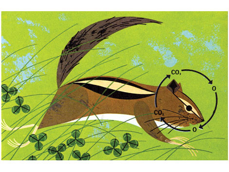
 Charley Harper is someone that inspired me last year for his use of colour and shape. What I find most fascinating about his work is that it was produced completely by hand, yet the work is so precise, it looks as though it could have been created on a computer. The subject matter in a lot of his work was based on science, yet his style made it interesting to the viewer, which for a mundane subject is extremely hard to do. Though you are able to tell what each animal is in his work, Charley creates characters and gives each animal a personality, making his work extremely unique.


